The SRPC has grown and evolved over the years, and in 2019 we felt it was time to reflect this in our new logo. The SRPC was started by physicians who worked in agricultural areas of Southern Ontario and Western Quebec and the original logo reflects these agricultural roots. Over the past 27 years, the society has expanded and now has many members from all across the country. After careful consideration, we chose a logo that reflects all parts of rural and remote Canada with a modern, clean look.
Color is an essential element to any logo so the red Canadian maple leaf was chosen. Red evokes feelings of power, passion, determination, and warmth. It also represents friendship, hospitality, and joy. All true characteristics of any rural health care professional.
A canoe paddle was inserted as representation of rural, remote, and Indigenous communities. It symbolizes great wisdom, a tool of exploration and discovery, a connection to the natural world. The paddle is still a tool of labour in many parts of the county, but is also a tool of recreation. Canadians paddle in every province and territory across the county. The paddle is used in water; water is a symbol of life, healing, and transformation.
It was important to have a new look, but also as important for some aspects of the original design to remain. The snake, which represent healing and medicine was coloured green, a colour of nature and a symbol of life and new beginnings.
We feel the logo stays true to our roots while still reflecting the evolution of our organization. We are very pleased with the new look and hope you like it too!

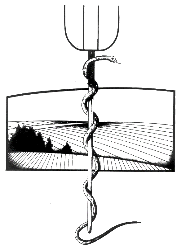
The first SRPC logo was designed when the SRPC was based in Mount Forest, Ontario, and by the time the first SRPC conference was staged in 1993 the name and the logo were established.
We reached out to Dr. Ken Babey, as the concept of our original logo was brought to art by a patient and friend of his, Mr. Gary McLaughlin, a talented artist and commercial illustrator.
In 1991-92 a group of Mount Forest physicians became the epicenter of the politics for rural medicine when they caused the Ontario Ministry of Health to recognize rural medicine as an unique entity. This led to both funding and educational initiatives that were beneficial to the practice of rural medicine.
On the ground in Mount Forest they were inundated with calls and requests for information and help from other communities. As the concepts they were promoting spread rapidly and there was a need to interact with a wider public, they needed a way to reach out, support, and be recognized. This was difficult in the rural world pre electronics and social media and it was suggested they form a society of like-minded people and try to make the momentum sustainable. They developed a newsletter that would be sent out to every rural physician they could identify.
It was at this time that they became aware of a group of physicians in Shawville, Quebec who were on a parallel course and were gearing up for their first Rural and Remote Medicine course. They decided to attend and see if that was another route to explore in developing a Society of like-minded rural physicians.
The necessity for a logo came out of these initiatives. They needed something to readily identify themselves on the newsletter and they needed a logo for their business cards.
The single snake coiled in the staff represented Asclepius and thus healing and medicine. Grant Woods’ 1930’s painting American Gothic immortalized the pitchfork as rural strength, determination and productivity, not to mention self-sufficiency. The pitchfork is itself a symbol of mischief, defiance, and to some degree the dark arts. This fit well with the activities of upsetting the status quo, mischievously intruding ourselves into various levels of decision making.
The background field was added which could be coloured blue for the coastal oceans and lakes, green for the fields and trees of the central provinces, or yellow for the wheat of the prairies.

